
Riot Games
UX/UI Redesign & Rebrand
Summary
A UX/UI case study and redesign of the character menu selection of one Valorant.
My Role
This project took place in 2023 as a personal passion project, and I took on the role of a UX/UI designer to redesign the character selection menu for Riot Games’ flagship first-person-shooter game, Valorant.
The Ask
The main goal of this project was to visually rebrand the Valorant character selection menu to make it more visually appealing and more reflective of Riot’s other branding. Along with this, I wanted to make slight changes to the functional aspects of the design to create a more streamlined user experience.
Pain Points
I began with identifying the current pain points of Valorant’s agent selection menu to see how it can be improved. I conducted video-call style interviews with a few of my colleagues to get a scope of what the common pain points are. I found these main areas to be the most frequent pain points:
Overwhelming Information
In an environment such as a character selection menu, decisions are time-sensitive and users need to get as much information as possible in the available time.
Valorant’s current UI makes it difficult for users to quickly skim through the ability description text (right side of the screen) and get the information they need due to all the text being one colour.
Team-composition is key in a video game such as Valorant.
Currently, Valorant displays icons in the bottom left of the character icon to tell players what role each player is selecting. However, icons are arbitrary until learned and the lack of text makes it difficult for players to know which role their teammates are picking.
Visual Clarity
The timer is not noticeable enough and could benefit from an increase in contrast. Its location could also be moved to be better consolidated with the rest of the information.
General visual changes could be made to increase contrast and improve overall visibility.
Mic icon currently does not dim when not in use, making it hard for users to tell which players are talking.
The timer blends into the background and could benefit from greater contrast.
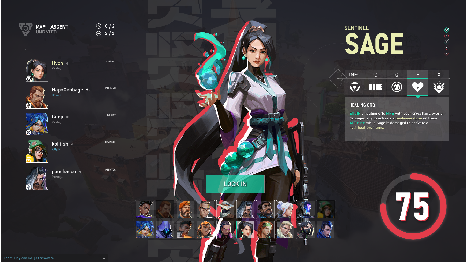
Valorant’s Current Character Selection Menu
Workflow
As this project was largely focused on improving the visual branding and appeal of the agent selection menu, I wanted to ensure that I have a solid understanding of Riot’s branding across all mediums.
I conducted a lot of research into Riot Games’ own marketing assets across various different platforms (social media & in-game) to get inspiration on how to best redesign the Valorant agent selection UI in a way that remained true to Riot’s branding while also modernizing it.
In many of RIot’s social media posts there is a heavy use of bold, colourful 2D-assets in their branding. Valorant has no shortage of these 2D assets in forms like character models and splash arts, so I felt that this style of art would greatly improve its current character selection menu by bringing some vibrancy and character to the design.
Low & High-fid Prototypes
Below is the low-fidelity prototype that I created in Adobe XD. During this stage, particular attention was spent on the reorganization of content and visual assets such as icons.
Two high-fidelity prototypes were created
The first one incorporates Riot’s signature red as the character outline.
The second version is one I created where I envisioned the character outline colour changing dependent on the character’s signature colour.
Changes are outlined in greater detail in the following section.
Changes Overview
Changes
Overwhelming Information
Text now incorporates highlights so that gamers can quickly skim and see what key leads to what effect.
Text has been added next to the character to designate their role - this helps with newer players who do not know what each icon means.
Changes
Visual Clarity
The overall visual has been rebranded to use Riot’s 2D character model art for a more modern, vibrant feel that better reflects their branding across other platforms.
Timer icon has been moved to the bottom left to help consolidate all information in one location, and Riot’s signature red has been implemented to it for greater contrast to improve visibility.
Minor UI changes have been incorporated:
Microphone icon has been added next to the player selection screen on the left to help users easily identify which players have their microphone off, on, or if players are talking or not.
Background of the selection screen now displays the map that players will be playing on.
Subtle highlights have been added to icons to improve visibility.